How to use Texture in Paintings
Why You Should Add Texture to Your Portraiture
To an artist, texture means so much more than a sensation brought on by touching something physical. It can tell a story and make something two-dimensional appear three-dimensional. It can be applied, established through paper choice, scratched into a surface and built upon, layer after layer. The possibilities of texture in art are practically limitless.
What’s more, texture can also be used as a tool to spark a certain emotion from the viewer. This is especially true when used in an art genre like portraiture. Texture can help to capture a glimpse into the mood, personality and thoughts of the subject while also assisting in making the viewer feel a certain way.
To inspire you to incorporate more texture into your art, here are 10 remarkable portraits with brilliant textural elements from artists featured in Strokes of Genius 8. Enjoy!e Moment
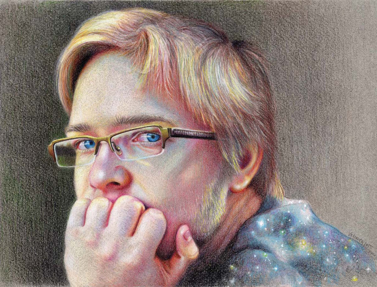
Adolescence by Veronica Winters, colored pencils on Canson pastel paper
On a family vacation, I took a picture of my son. It was a lucky moment: His eyes were a lot more telling than posed smiles. I aimed to depict the intensity of his gaze, the look of adolescence seen in the thoughtfulness and contemplation of that moment.
Colored pencil drawing requires the use of smooth paper. Here I deviate from the norm and draw on pastel paper instead. The unfilled spaces of the colored, slightly textured paper mix optically with the colored pencils, revealing the texture of skin and hair.
I work on details with very sharp Caran d’Ache Pablo pencils and shade everything else using soft, permanent Caran d’Ache Luminance and some Lightfast Premier Prismacolors.
— Veronica Winters
Hard Lines, Hard Times
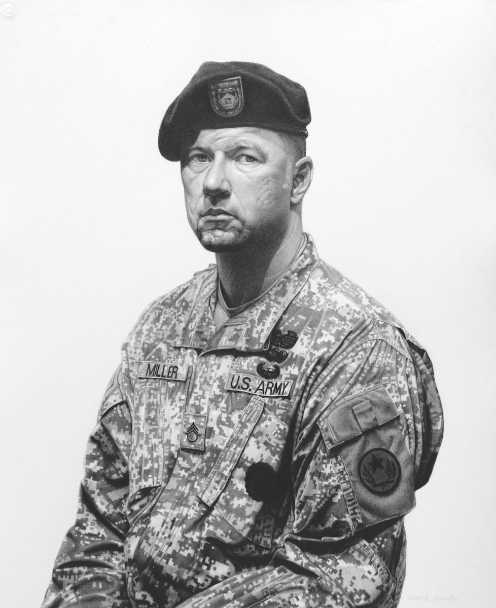
The Patriot by Clark Louis Gussin, Mars pencils on Strathmore bristol
The more I got to know my son-in-law, a career combat soldier, the more I was compelled to make his portrait. I traveled to Texas for a formal sitting where I was able to control the pose, the lighting and the mood.
After choosing the desired pose from the photography session, I was excited by the challenge to render the textures and crypsis (i.e., camouflage pattern) of his uniform, and hopefully capture the hard years etched on his face and resonating from his gaze. It took me three months to complete rendering and modeling.
The value transitions of the surface textures were achieved using General’s charcoal pencils and charcoal powder applied with stumps and tortillons.
— Clark Louis Gussin
Bringing an Idea to Life
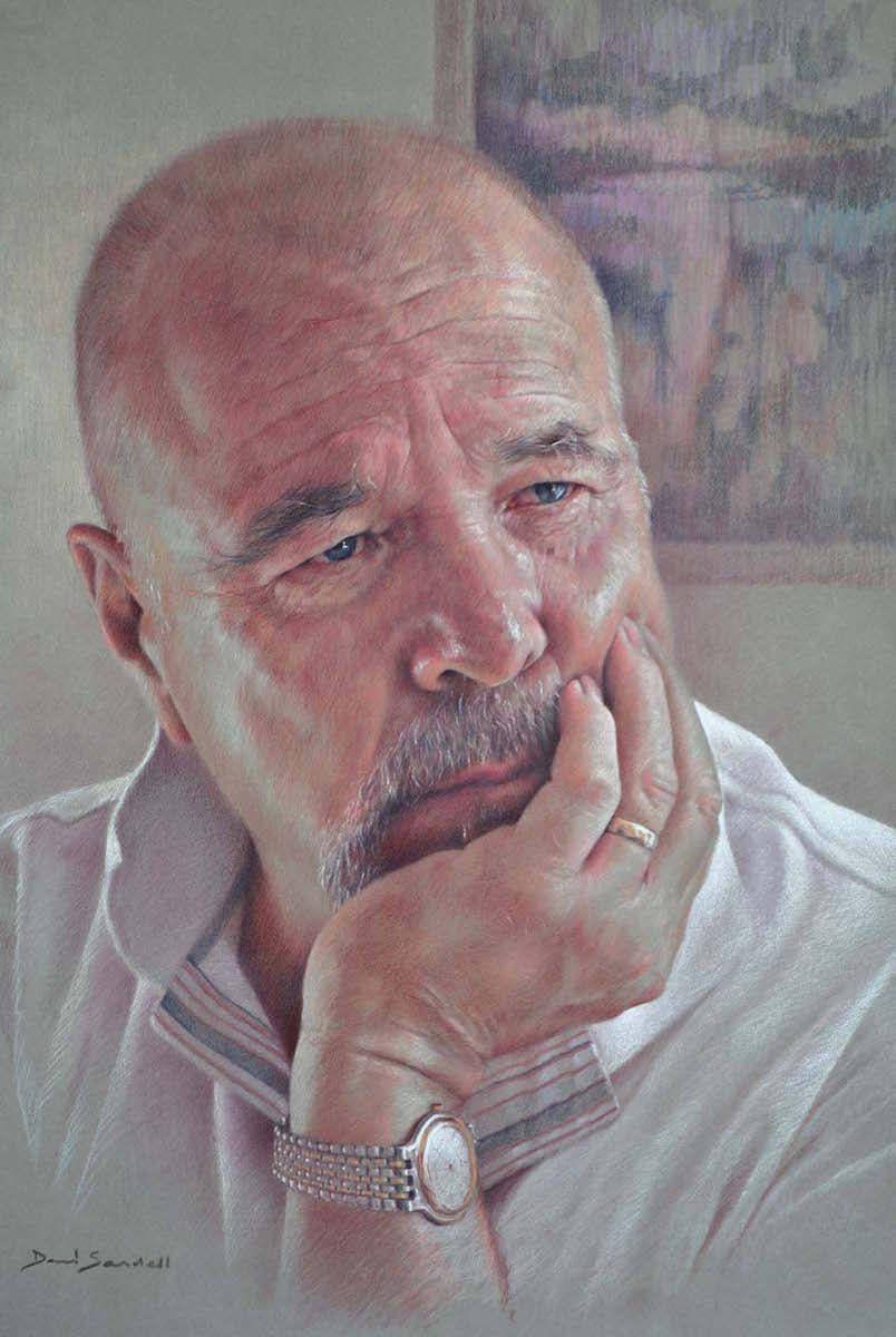
Wileman by David Sandell, Derwent Studio and Caran D’Ache Luminance pencils on PastelMat
This drawing started life as an idea for an oil painting, then it developed its own credibility so I ran with it. The subject is an old friend and renowned painter, Peter Wileman. I felt it was important to reflect his character through the texture and landscape of his face as affected by light from a nearby window.
I developed the basic drawing from my own photographic studies, drawing with Derwent Burnt Carmine and white, then bringing in the warm and cool halftones on either side of his face with Luminance Burnt Sienna, along with pinks and grays.
— David Sandell
Erasing Unease
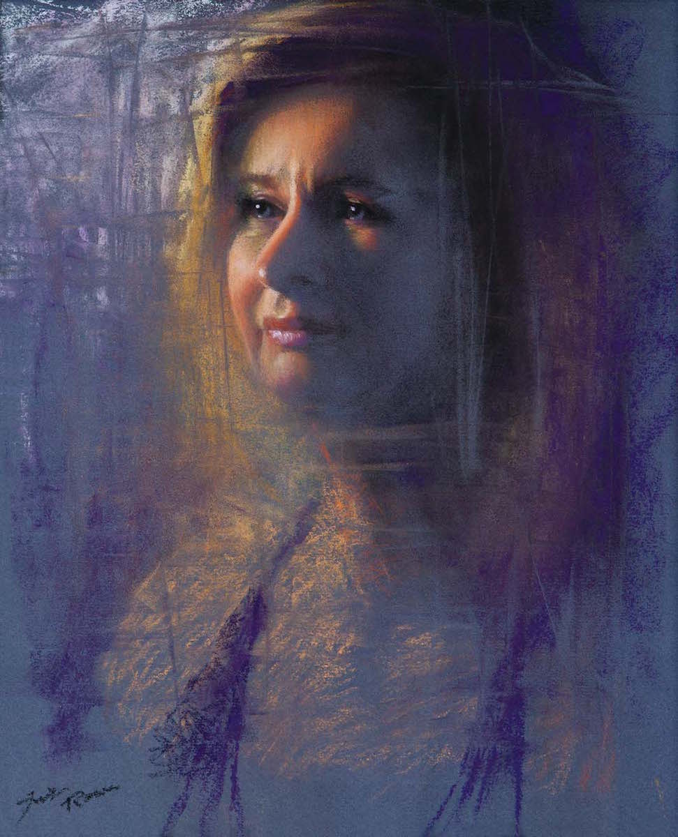
Out of the Blue by Jennifer Rowe, pastel on Canson paper
Using reference photos allowed me ample time for experimentation with this portrait. Feeling dissatisfied with my initial results, I grabbed a Prismacolor Magic Rub eraser and made random strokes with its edge.
When I stepped back I saw that the eraser marks had serendipitously framed the face, which I was then inspired to further refine. The juxtaposition of the loose textural background and the tightly rendered visage brings a heightened emotional quality to this piece and leaves room for the viewer’s imagination.
— Jennifer Rowe
Creative Experimentation
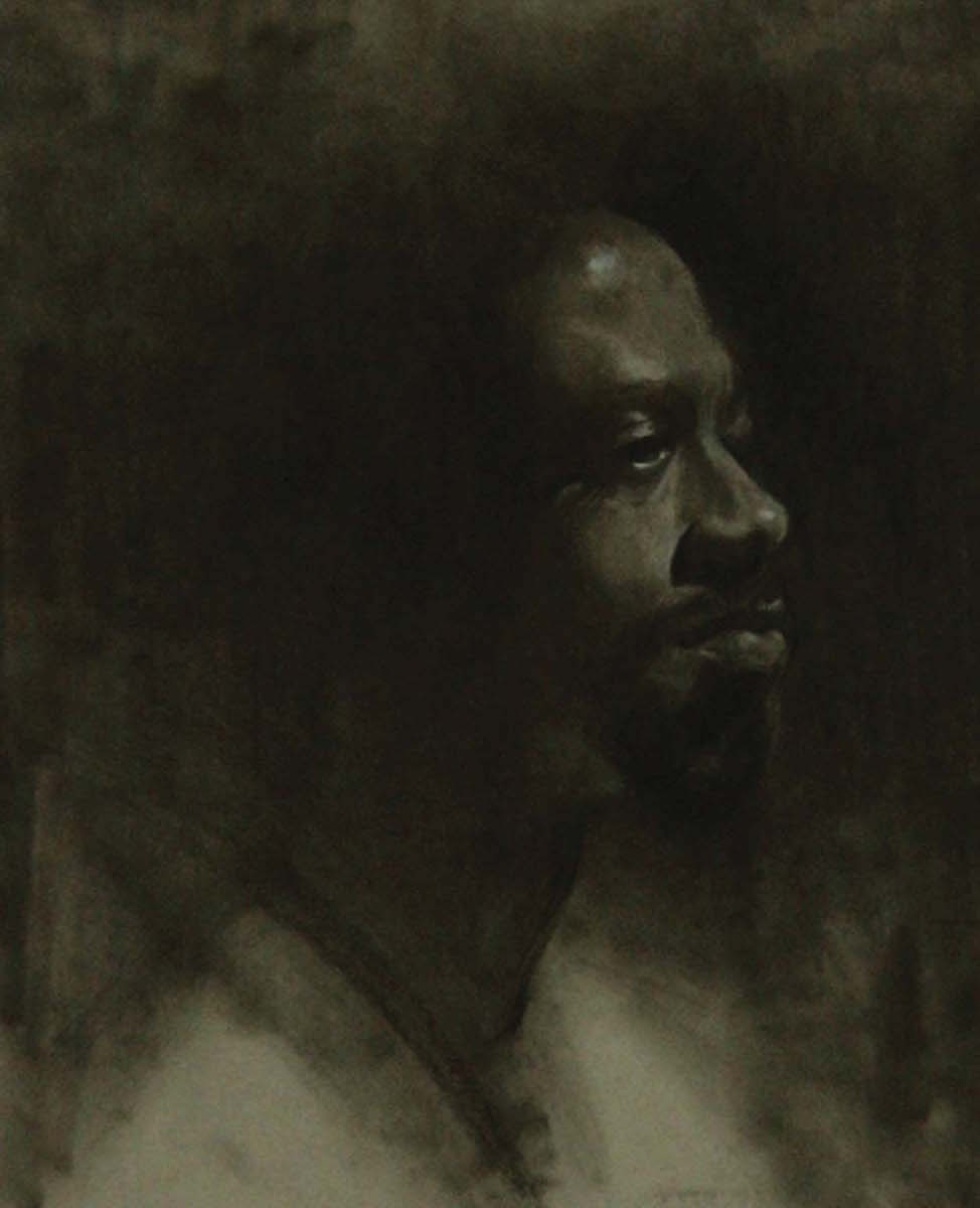
Kevin by Chris Page, Black PanPastel and General’s black and white charcoal pencils on Strathmore gray-toned paper
I did this portrait of New York model Kevin as a kind of creative experiment. First, I painted Kevin from life, using a monochromatic palette of Terra Rosa and Venetian Red, both by Vasari, on a gray-toned panel.
Next, I photographed both the painting and Kevin in black and white. And, finally, I created this drawing from those sources. My primary intention was to first gain a solid structural understanding of my subject, and then hope that it translated into a solid piece.
–Chris Page
Lost in Thought
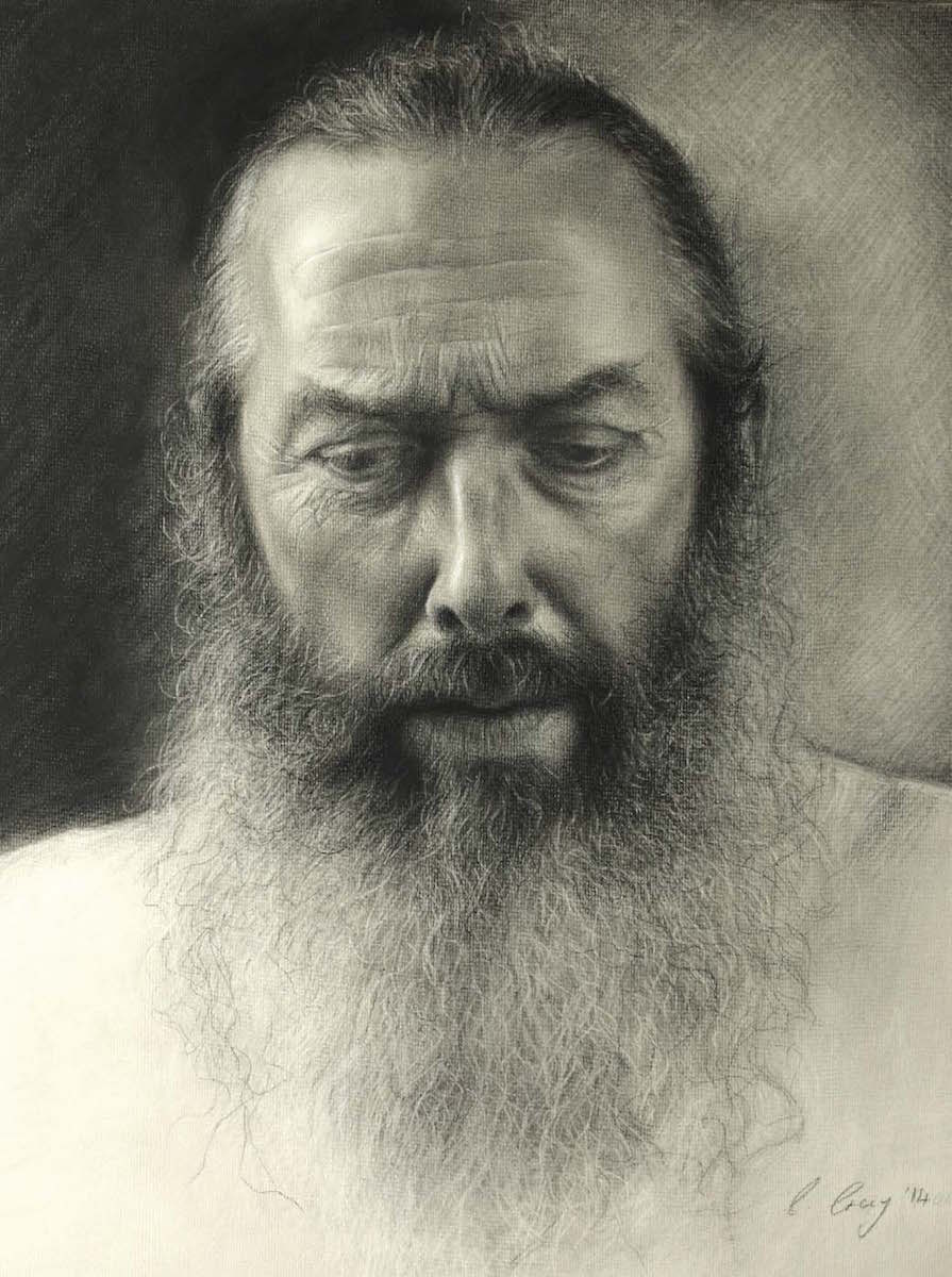
Thoughts by Catherine Creaney, Soft pastel and pastel pencil on Fabriano Tiziano paper
Thoughts portrays my mother’s partner and caregiver for more than 20 years. His appearance often reminds me of philosophers or biblical characters, and that is how I wanted to depict him in this portrait.
Working from photography, I can capture fleeting moments and expressions. I used a combination of soft pastel and pencil in both the underdrawing and final drawing stages, adding highlights and hair and skin texture with putty rubber, an eraser stick and a few touches of white pastel pencil. I merely hinted at certain areas so as not to overwork it and lose the vitality.
— Catherine Creaney
Paper Power

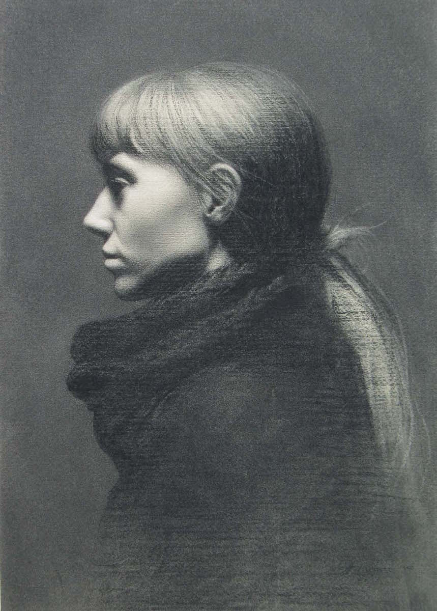
Laurie in Profile by Marnie White, charcoal on paper
This is part of a drawing series of my friends and acquaintances. The background noise has been stripped away to draw attention to form and texture. In these quiet drawings, I focus on my subjects and investigate the poignant humanity of daily life.
The texture of the paper accentuates the drawn texture. Smooth areas like Laurie’s skin are juxtaposed with looser strokes in the hair and sweater. I prefer to work from life but also use reference photographs. I find preliminary sketches from life essential to keeping my work looking fresh.
— Marnie White
Taking a Walk in Someone Else’s Shoes
Hard Times by Wendy Layne, Polychromos colored pencils and white gel pen on cream Stonehenge paper
Walking in downtown Houston, Texas, I came across a man with tattered clothing perched on a concrete bench with a large duffle bag beside him. The lines in his face told a thousand stories. He gazed at me with gentle eyes, so I approached him. After a long conversation about his life, I asked permission to photograph him for my Faces of Humanity series.
I started the drawing with the eyes — the single most important detail to convey emotion. The gel pen added a depth to the beard and highlights to the thread in his knitted hat. I left the background simple to represent how his surroundings were insignificant compared to his own physical requirements to merely survive.
— Wendy Layne
Thinking Outside the Box

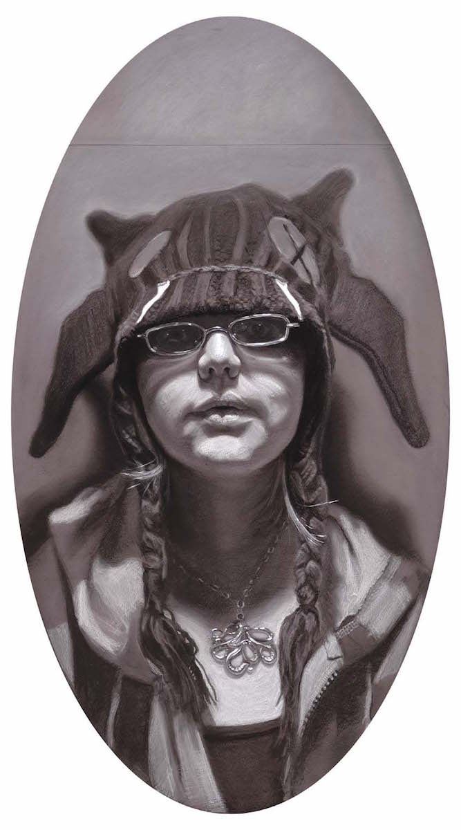
Defense Mechanisms by Mark A. Hanavan, charcoal and acrylic on Canford cardstock
Defense Mechanisms is from a recent series where I turned my focus toward my animation students. This unique subculture contrasts with traditional societal norms. Contrasting textures, then, become a visual metaphor for this feature of the sitter.
The oval format unifies as it repeats the ovals in the image, but contrasts by the fact that the sitter is not the customary subject of an oval format. Even the space above the figure was intentional, suggesting that the subject is not fitting into our frame of reference.
— Mark A Hanavan
Seeing the Soul
Good Place for a Handout by Nina Ashraf Asmi, Conté crayon on Mylar
Drawing portraits from life, I seek to portray our shared humanity. I start with no preconceived notion of the finished portrait.
An interplay of random marks, textural strokes and empty spaces lets the viewer inside — with the intention of revealing a glimpse of the soul. I like Mylar because it is receptive to different kinds of strokes without dictating any textures of its own.
— Nina Ashraf Asmi

